Corporate · Single column · ATS 5/5
Hybrid CV template
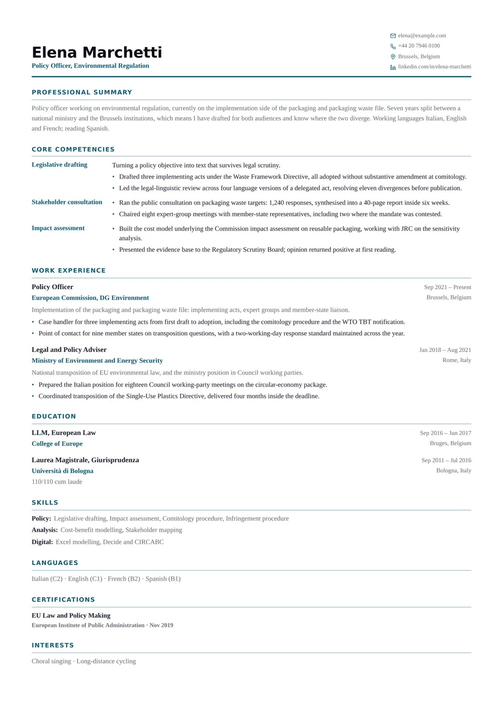
Competencies stated up front, then the full chronological history behind them.
Restraint is the point. A corporate layout should make your results easy to find and give the reviewer nothing else to react to. It runs as one column with no photo, which is the combination most application portals and most UK, US and Irish employers prefer.
The design
About the Hybrid CV layout
Who it’s for
The readers and situations this layout was drawn for.
- Senior candidates whose job titles undersell what they actually do
- Applicants moving between industries with a solid record in each
- Roles where a recruiter screens on capability and a hiring manager on history
Key features
What is actually different about this template on the page.
- Competency table with the claim beside its evidence
- Full chronological history retained below
- Tinted rule under every section heading
- Single column, five-out-of-five parser safety
ATS score 5/5 · Excellent
How this layout behaves in an applicant tracking system
It holds the full 5 out of 5 for a simple reason — no sidebar, no table, no text baked into an image. What you upload is very close to what the system reads back.
Because there is only one text column, an extractor never has to decide which block to read first — the page has exactly one reading order and it is the one you can see.
There is little left to fix here. If you want to see how the rest of the parser-safe range compares — and what a 5 out of 5 is actually measuring — the ATS CV templates page scores every layout on the same criteria.
- Reading order
- Single flow
- Headings
- Real text
- Tables
- None
- Images
- None
- Selectable text
- Yes
Scores are our own assessment of how a parser handles the layout — never a guarantee about one specific employer’s system.
In practice
Three situations Hybrid CV is the right answer to
A large-employer application portal
You are uploading a PDF into a careers site that will index it before a recruiter opens anything. This layout is designed for precisely that first reader, so nothing is lost between the upload button and the recruiter’s screen. A typical example: Senior candidates whose job titles undersell what they actually do.
Numbers first
Competency table with the claim beside its evidence is the part of Hybrid CV that decides this. Achievements stay directly under the role they belong to, so a promotion track inside one employer reads as a single story rather than three disconnected entries — the thing internal-mobility and executive reviewers look for first.
A UK, US, Canadian or Irish application
Employers in these markets discourage photographs outright — some screening teams remove them before a hiring manager sees the file, to keep the process defensible. Starting without one means nothing has to be removed. Hybrid CV has no photo slot to remove, so the same file works in every market you send it to.
Make it yours
Customising Hybrid CV
Accent colour
Hybrid CV ships with #155e75. The colour appears in the header band and the section rules, which is enough to look considered and little enough to stay sober. If you are applying to a firm whose brand you know, matching it quietly is a reasonable move.
Density
Font size, line height, section spacing and page margins are all sliders. On a single column they behave predictably: reduce section spacing first, margins second, and only then the type size — a CV set below 9.5pt starts to look like an attempt to hide its length.
What this layout fixes
Move certifications up if they are the licence to practise in your field, and down if they are professional development. On this page, position is the signal. There is no photo slot to switch off, which is the point: nothing has to be removed before sending it to an employer that does not want one.
Hybrid CV: common questions
Alternatives
Related templates
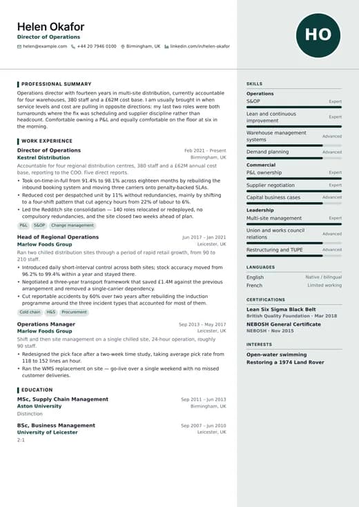
Management CV
corporate · two columns
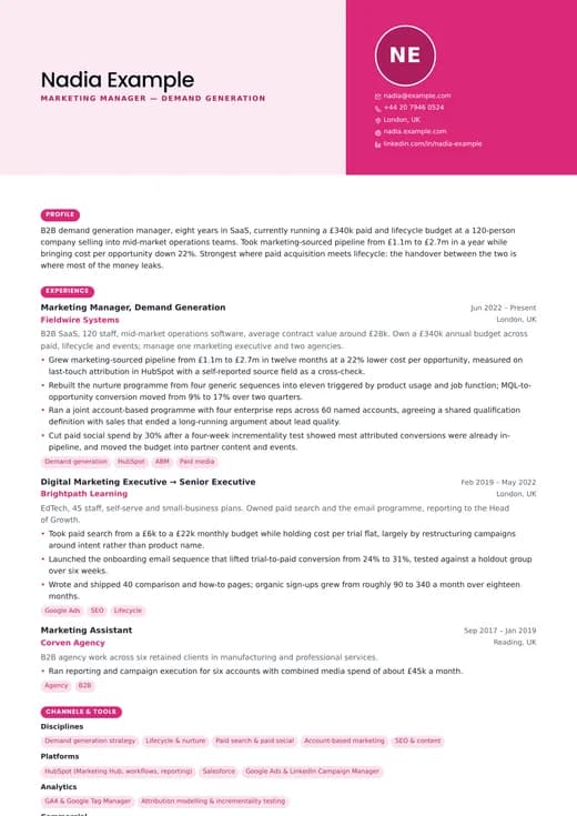
Marketing CV
corporate · one column
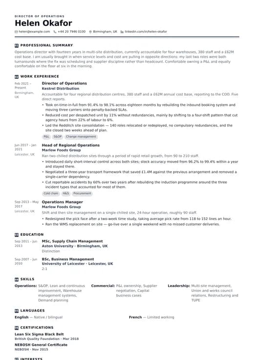
Operations CV
corporate · one column
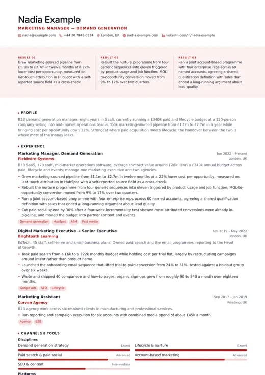
Sales CV
corporate · one column
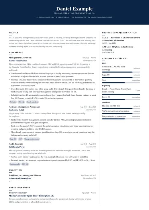
Banking CV
corporate · two columns
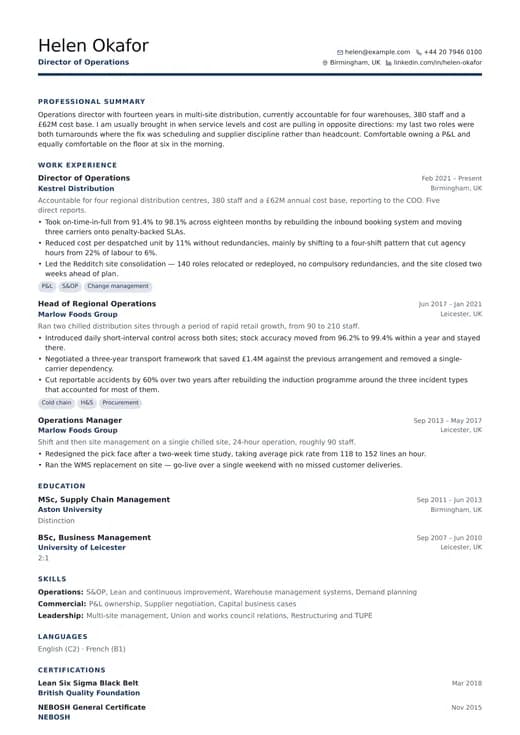
Business Professional
corporate · one column
Keep exploring
- All corporate templatesEvery design in the Corporate family, side by side.
- One-column templatesThe full single-column range, across all six categories.
- CV templatesFormats, page counts and conventions by country and career stage.
- ATS CV templatesWhat a parser does with your file, and the layouts built to survive it.
- CV examplesWorked examples by role, with the wording and structure explained.
- Pricing and plansWhat Pro unlocks, and how the one-off Lifetime plan compares.
Start your CV with Hybrid CV
Open it with the example content already in place, replace it with your own, and download a PDF when it reads the way you want. Switching to another template later keeps every word you have written.
Free to start. A Pro or Lifetime plan unlocks this design and every other one.