Creative · Single column · ATS 5/5
Creative ATS CV template
A creative CV that a parser reads as plain text — no columns, no graphics.
Creative templates spend their design budget where a studio reviewer will notice it, which is the opposite of what an automated screen rewards — a trade-off worth making deliberately. It runs as one column with no photo, which is the combination most application portals and most UK, US and Irish employers prefer.
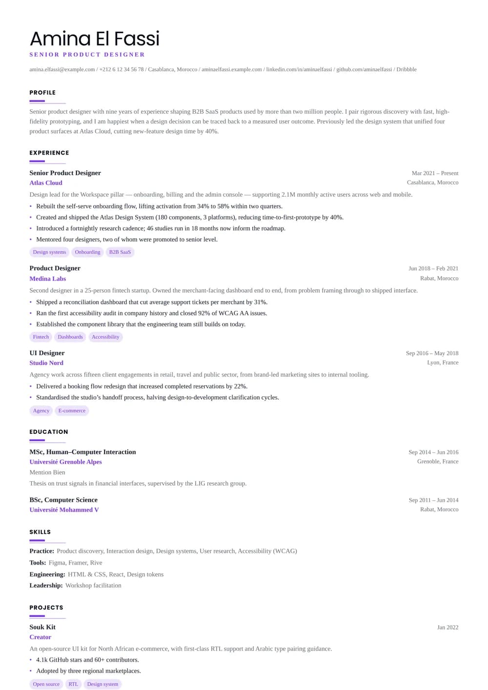
The design
About the Creative ATS layout
Who it’s for
The readers and situations this layout was drawn for.
- Designers and writers applying through Greenhouse, Workday or Lever
- Creative roles at large companies with automated screening
- Anyone who wants personality without gambling on the parser
Key features
What is actually different about this template on the page.
- Character from type and space, not from graphics
- Single column with no sidebars, icons or bars
- Stepped accent rule under each section heading
- Portfolio and profile links kept as plain selectable text
ATS score 5/5 · Excellent
How this layout behaves in an applicant tracking system
It holds the full 5 out of 5 for a simple reason — no sidebar, no table, no text baked into an image. What you upload is very close to what the system reads back.
Sections stack in a single flow, so the order you set in the editor is the order the parser records: summary, then experience, then education, then whatever you put next.
Frames, tinted panels and centred headings are drawn rather than written: they never confuse a human, but they are the reason the extracted text can come out in a different shape from the page you see.
There is little left to fix here. If you want to see how the rest of the parser-safe range compares — and what a 5 out of 5 is actually measuring — the ATS CV templates page scores every layout on the same criteria.
- Reading order
- Single flow
- Headings
- Real text
- Tables
- None
- Images
- None
- Selectable text
- Yes
Scores are our own assessment of how a parser handles the layout — never a guarantee about one specific employer’s system.
In practice
Three situations Creative ATS is the right answer to
A large-employer application portal
You are uploading a PDF into a careers site that will index it before a recruiter opens anything. This layout is designed for precisely that first reader, so nothing is lost between the upload button and the recruiter’s screen. A typical example: Designers and writers applying through Greenhouse, Workday or Lever.
Craft on the page
Character from type and space, not from graphics is the part of Creative ATS that decides this. Everything runs in one column, so a long list of projects and commissions keeps the sequence you chose — and the sequencing is part of the edit when the reader is a creative director.
A UK, US, Canadian or Irish application
Employers in these markets discourage photographs outright — some screening teams remove them before a hiring manager sees the file, to keep the process defensible. Starting without one means nothing has to be removed. Creative ATS has no photo slot to remove, so the same file works in every market you send it to.
Make it yours
Customising Creative ATS
Accent colour
Creative ATS ships with #7c3aed. The accent is doing real work here rather than decorating, so pick it the way you would pick a colour for a piece of work: against the images you will be sending alongside it.
Density
Font size, line height, section spacing and page margins are all sliders. On a single column they behave predictably: reduce section spacing first, margins second, and only then the type size — a CV set below 9.5pt starts to look like an attempt to hide its length.
What this layout fixes
Skills as a long tag list works better here than a rated one: the reader is looking for tools they recognise, not for how you scored yourself. There is no photo slot to switch off, which is the point: nothing has to be removed before sending it to an employer that does not want one.
Creative ATS: common questions
Alternatives
Related templates
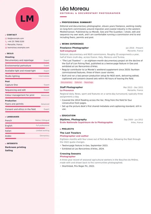
Creative Designer
creative · two columns
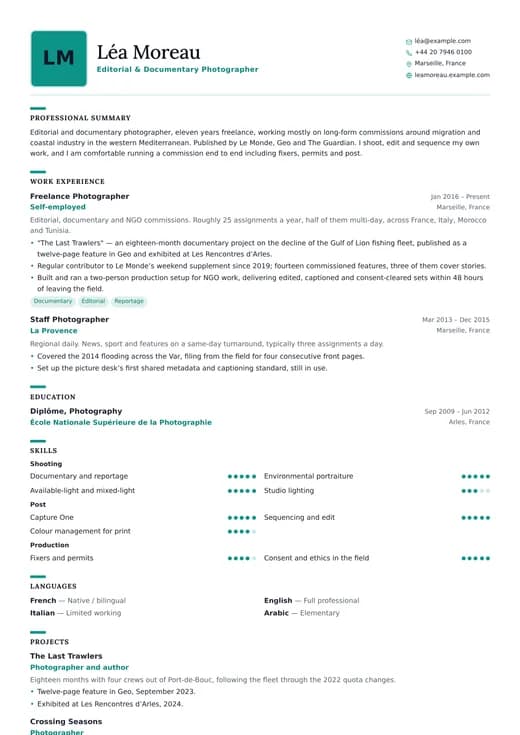
Creative Professional
creative · one column
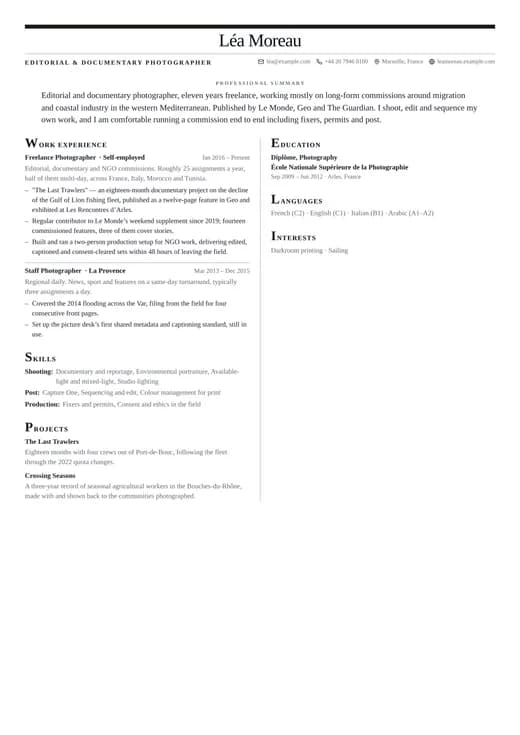
Editorial
creative · two columns
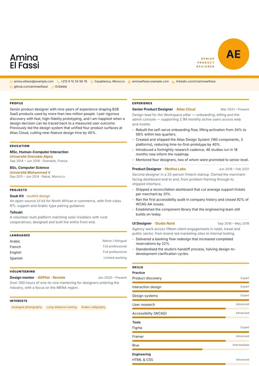
Graphic Designer
creative · two columns

Photographer
creative · one column
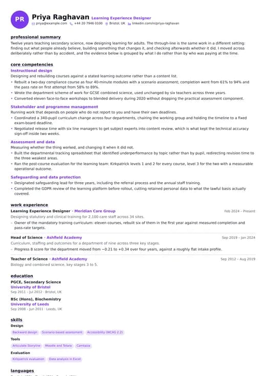
Portfolio Style
creative · one column
Keep exploring
- All creative templatesEvery design in the Creative family, side by side.
- One-column templatesThe full single-column range, across all six categories.
- CV templatesFormats, page counts and conventions by country and career stage.
- ATS CV templatesWhat a parser does with your file, and the layouts built to survive it.
- CV examplesWorked examples by role, with the wording and structure explained.
- Free CV templatesEvery template you can use and download without paying.
Start your CV with Creative ATS
Open it with the example content already in place, replace it with your own, and download a PDF when it reads the way you want. Switching to another template later keeps every word you have written.
Free plan, free download, no credit card.