Modern · Two columns · ATS 3/5
Coloured Sidebar CV template
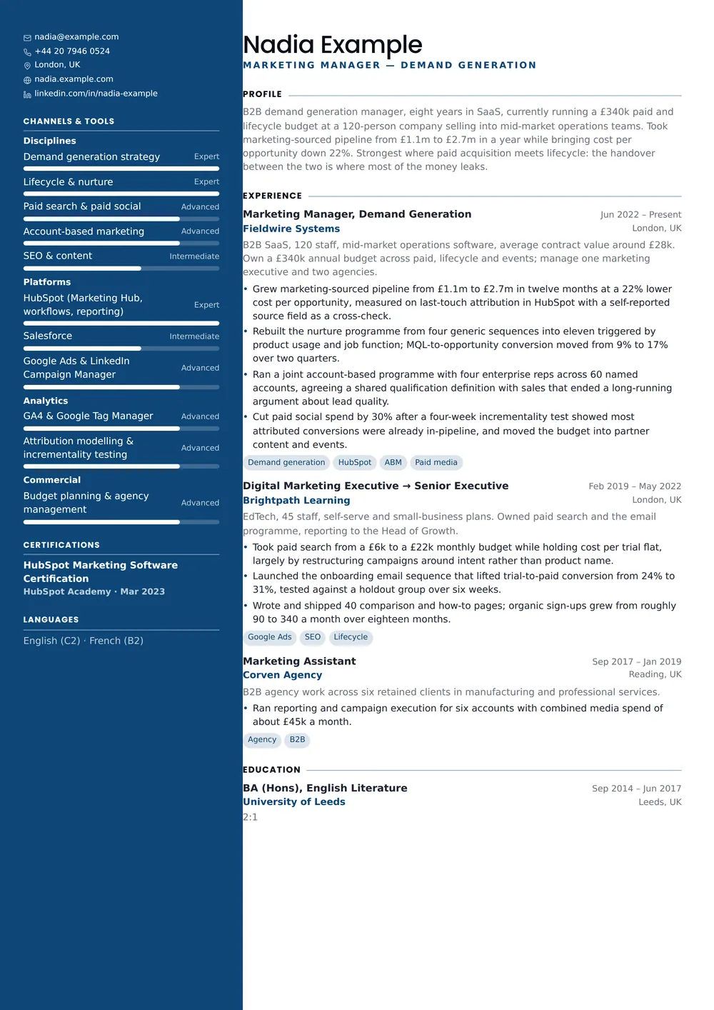
A full-height saturated sidebar in your accent, with the type reversed out of it.
The design work here is in the spacing and the hierarchy rather than in ornament, which is why it reads as contemporary without dating the way a heavily styled CV does. A two-column page with a portrait: more information density and more visual anchoring than a single column, at the usual cost in machine readability.
The design
About the Coloured Sidebar layout
Who it’s for
The readers and situations this layout was drawn for.
- Marketing, sales, hospitality and client-facing roles
- Anyone who wants a CV that reads as designed at a glance
- Applications sent directly to a person rather than through a portal
Key features
What is actually different about this template on the page.
- Full-bleed accent band that continues onto page two
- Reversed-out contact block and photo
- Automatic light or dark type depending on your accent
- Skills, languages and interests in the band; history beside it
ATS score 3/5 · Moderate
How this layout behaves in an applicant tracking system
It scores 3 out of 5: expect the content to survive and the structure to be approximated. Where the sidebar text lands in the extracted version is genuinely unpredictable between systems.
Two columns mean two reading orders, and the parser picks one. Modern systems handle it well, older ones read straight across the page and mix the side column into your experience.
A photograph is invisible to a parser and occasionally counts against you in US and UK screening. Turn it off for portal applications and keep it for the version you email directly.
A single column parses more reliably than two, in every system we have tested against. If the application goes through a portal you do not recognise, or the employer is large enough to screen automatically, send a one-column version instead — the ATS CV templates are built for that job, and your content moves across without being retyped.
- Reading order
- Two blocks
- Headings
- Real text
- Tables
- None
- Images
- Photo only, optional
- Selectable text
- Yes
Scores are our own assessment of how a parser handles the layout — never a guarantee about one specific employer’s system.
In practice
Three situations Coloured Sidebar is the right answer to
A pitch to a client or an agency
Attached to a proposal or an introduction rather than an application form. Density and hierarchy matter more than machine readability, because the file is going straight to a human. The reader it was drawn for: Marketing, sales, hospitality and client-facing roles.
A career that reads in order
Full-bleed accent band that continues onto page two is the part of Coloured Sidebar that decides this. Moving skills, tools and languages into the side column keeps the main narrative about outcomes, which is what you want when your experience is strong but your skills list is long enough to crowd it out.
A brand-led or public-facing role
When the job involves being seen — presenting, hosting, teaching, selling — a portrait is content rather than decoration, and this layout treats it that way. If the employer asks for a document without one, the photo toggle in the editor removes it and Coloured Sidebar re-balances the header on its own.
Make it yours
Customising Coloured Sidebar
Accent colour
Coloured Sidebar ships with #0f4c81. Pick the accent last, after the content is settled. On this layout it is doing emphasis rather than decoration, so the right choice depends on which lines you want a reader to land on first.
Density, on a divided page
The column split is fixed, but everything inside it is not: type size, line height, section spacing and page margins all adjust, and on a divided page the margins are the setting that buys you the most room without crowding the rule between the columns.
The photo, and what happens without it
With the photo on, the side column reads as a profile; with it off, as a reference list. Both work in this layout, but they are different documents and it is worth looking at each.
Coloured Sidebar: common questions
Alternatives
Related templates
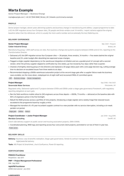
Modern ATS
modern · one column
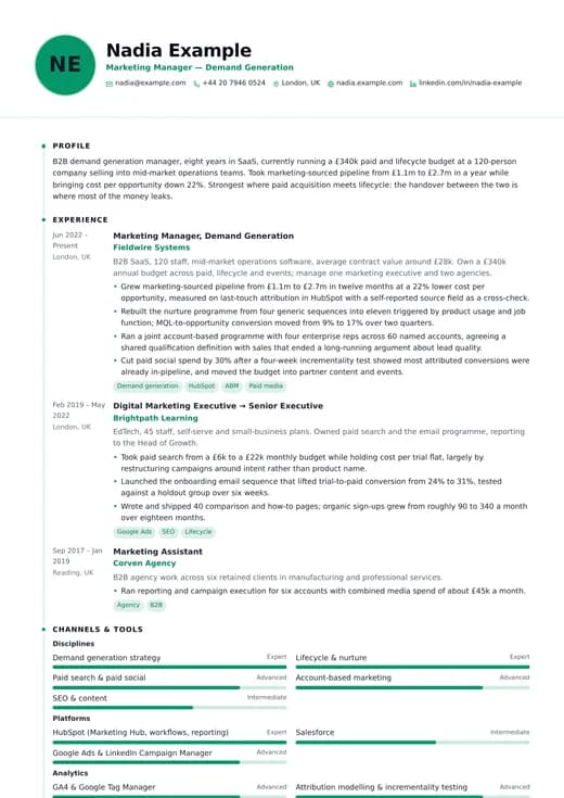
Modern Clean
modern · one column
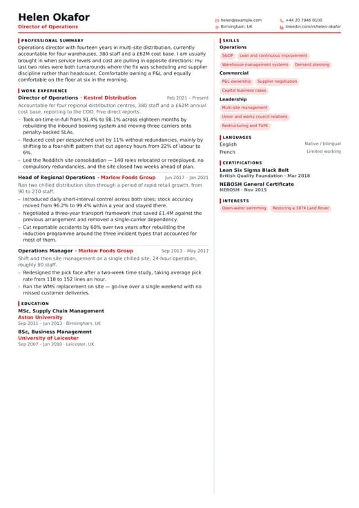
Modern Compact
modern · two columns
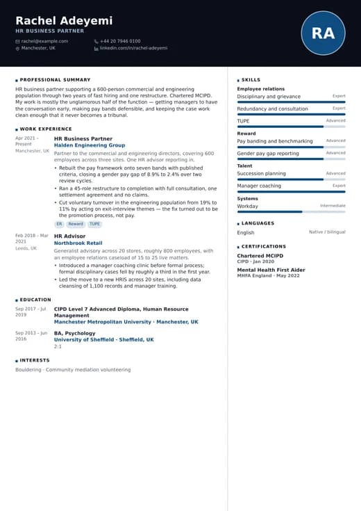
Modern Corporate
modern · two columns
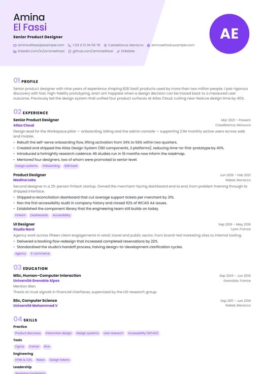
Modern Creative
modern · one column
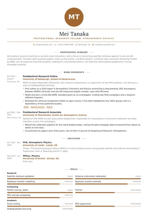
Modern Elegant
modern · one column
Keep exploring
- All modern templatesEvery design in the Modern family, side by side.
- Two-column templatesEvery split-page layout, for CVs with a lot to fit in.
- CV templatesFormats, page counts and conventions by country and career stage.
- ATS CV templatesWhat a parser does with your file, and the layouts built to survive it.
- CV examplesWorked examples by role, with the wording and structure explained.
- Free CV templatesEvery template you can use and download without paying.
Start your CV with Coloured Sidebar
Open it with the example content already in place, replace it with your own, and download a PDF when it reads the way you want. Switching to another template later keeps every word you have written.
Free plan, free download, no credit card.